
Website Redesign
A website redesign for Catcher’s Alley, created to bring more clarity, structure, and polish to the online experience while making it easier for visitors to understand the business and take the next step.
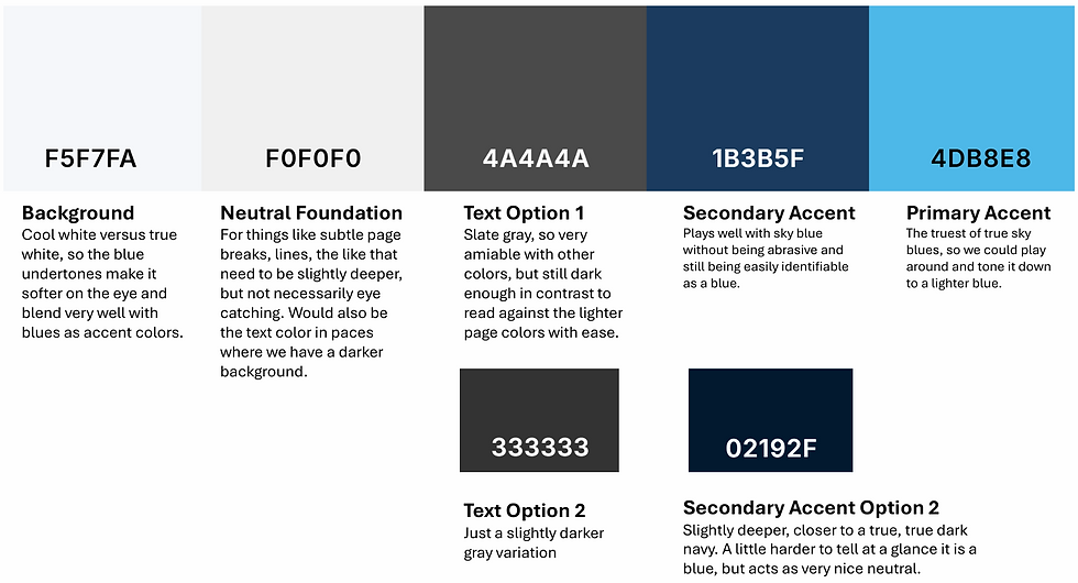
Professor Alaimo primary color palette
The Brand Direction
Professor Alaimo came into the project with a visual concept and specific details he wanted preserved. My role was to refine that direction into a usable brand identity, creating a logo and supporting visual system that could be incorporated consistently across the website.
From there, I developed the logo, primary color palette, secondary color palette and typography direction for the brand, presenting multiple options that aligned with the tone of the business.
The final direction used sky-inspired blues, soft cool whites, grounded neutrals, and deeper navy tones to create a visual system that felt calm, trustworthy, and professional. The palette was built to feel approachable while still giving the brand enough weight and contrast to support an expert-led coaching business.
Typography options were chosen with the same balance in mind: strong enough to communicate authority, but clean and readable enough to keep the site feeling accessible.
The Website Structure
Before building the site, I mapped out the user experience and created wireframes to organize the information clearly. Because Professor Alaimo offers several types of support, the site needed to make each service easy to understand without overwhelming the visitor.
The site structure was designed to help users quickly understand who Professor Alaimo is, who he helps, what coaching options are available, how one-on-one sessions work, what licensing and renewal support includes, and how to take the next step.
Every page was planned around clarity, trust, and ease of action.

Initial rough site structure planning sketch
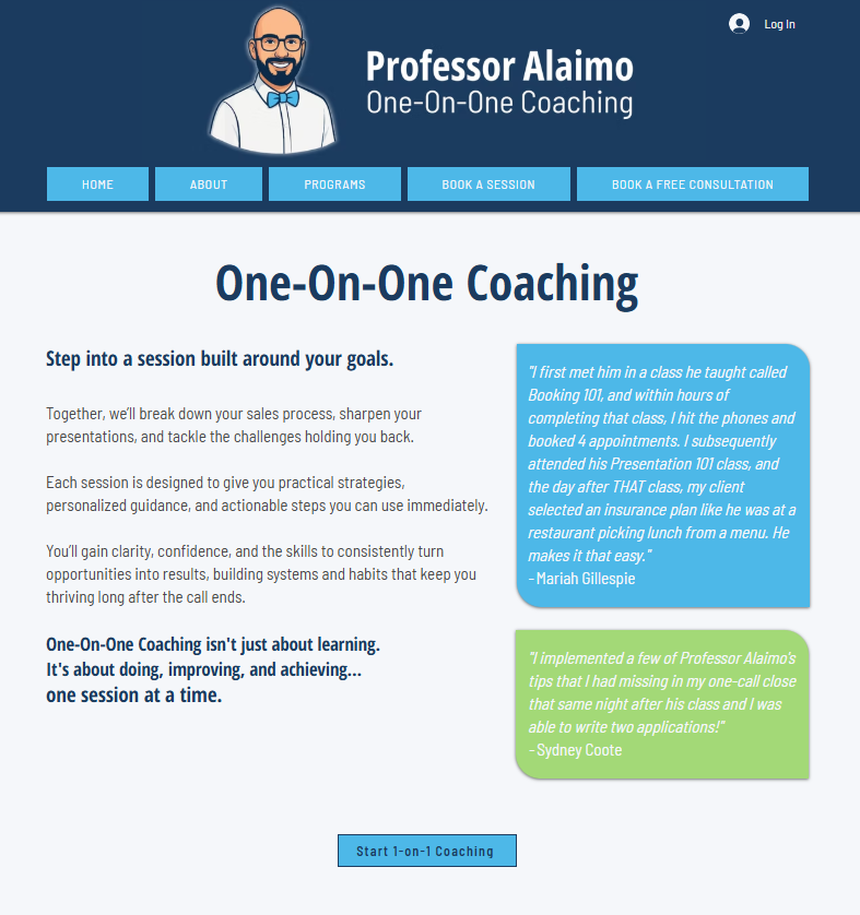
Final website layout
The Copy
I wrote all website copy for the project, translating Professor Alaimo’s expertise into language that felt warm, confident, and easy to follow.
The messaging focused on helping agents move from potential to production through structured one-on-one coaching, practical strategy, accountability, and support. Instead of relying on heavy sales language, the copy was written to make visitors feel understood and guided.
The final voice is professional, encouraging, and direct: clear enough for someone who needs answers quickly, but warm enough to make them feel comfortable reaching out.
THE BREAKDOWN
Professor Alaimo
Brand Identity, Website Copy, UX/UI Design & Website Build
Professor Alaimo needed a brand and website that could do two things at once: establish him as a trusted authority in insurance coaching while still feeling warm, approachable, and easy to learn from.
His work centers around helping new and struggling insurance agents build confidence, sharpen their sales process, and turn knowledge into consistent production. The goal was to create an online presence that reflected that same balance: structured, professional, encouraging, and clear.
Note: This overview reflects the original brand identity, website copy, UX/UI design, and website build completed by Loose Ends Creative. Images shown and the live site may include post-launch updates that differ from the original creative direction.
THE BREAKDOWN
Professor Alaimo
Brand Identity, Website Copy, UX/UI Design & Website Build
Professor Alaimo needed a brand and website that could do two things at once: establish him as a trusted authority in insurance coaching while still feeling warm, approachable, and easy to learn from.
His work centers around helping new and struggling insurance agents build confidence, sharpen their sales process, and turn knowledge into consistent production. The goal was to create an online presence that reflected that same balance: structured, professional, encouraging, and clear.
Note: This overview reflects the original brand identity, website copy, UX/UI design, and website build completed by Loose Ends Creative. Images shown and the live site may include post-launch updates that differ from the original creative direction.
The Challenge
Professor Alaimo wanted his website to feel welcoming from the first click. He did not want the brand to feel cold, corporate, or overly rigid. At the same time, the site needed to position him as an expert with the experience and structure to guide agents through booking, presenting, closing, licensing support, continuing education, and renewals.
The creative direction centered around one key idea: an open authority. Someone knowledgeable and experienced, but not intimidating. Someone who could lead with clarity while making visitors feel supported.
His main visual request was a blue that felt like the sky, which became the starting point for the full brand direction.
The Challenge
Professor Alaimo wanted his website to feel welcoming from the first click. He did not want the brand to feel cold, corporate, or overly rigid. At the same time, the site needed to position him as an expert with the experience and structure to guide agents through booking, presenting, closing, licensing support, continuing education, and renewals.
The creative direction centered around one key idea: an open authority. Someone knowledgeable and experienced, but not intimidating. Someone who could lead with clarity while making visitors feel supported.
His main visual request was a blue that felt like the sky, which became the starting point for the full brand direction.
THE BREAKDOWN
Catcher's Alley
A complete website overhaul for a baseball and softball academy, rebuilt for clarity, structure, and easier navigation.
The client came to me with a website in need of a little TLC. Catcher’s Alley needed a clearer way to organize its programs, training options, camps, coaches, events, and booking paths so families and athletes could find the right information more easily. We started with a few visual references they liked, then used those as the foundation for a full redesign.
My role included reworking the site layout, visual direction, page structure, responsive design, copy edits, and overall user experience. The redesign focused on turning a difficult-to-navigate website into a cleaner, more professional online home that better reflected the energy of the academy and made key next steps easier to understand.
Note: This overview reflects the original website redesign, UX/UI direction, page structure, responsive layout, copy edits, and website build completed by Loose Ends Creative. I do not manage the site on an ongoing basis, so images shown and the live site may include post-launch updates, edits, or changes that differ from the original redesign shown here.

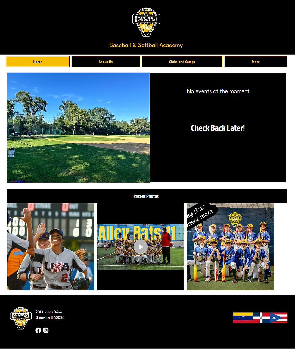
Catcher's Alley homepage before and after.
Catcher's Alley Homepage Before
Catcher's Alley Homepage After
The Starting Point
Catcher’s Alley came into the redesign with a website that had strong content and an active business behind it, but the online experience was not supporting that clearly. The site had issues with responsiveness, page organization, inconsistent layouts, and information that felt either too dense in some areas or too light in others. The original proposal identified problems with screen resizing, mobile optimization, overwhelming copy, overlapping visuals, inconsistent fonts, and navigation that needed to be simplified.
The goal was to create a full site reset — not just a visual refresh. The redesign needed to make the website easier for families, athletes, and teams to use while giving Catcher’s Alley a cleaner, more modern, and more professional online presence.
Strategy & Structure
The first step was organizing the information into a clearer structure. The original site had a large number of navigation items, including separate pages for camps, contact, booking, coach information, gift cards, store items, and program details. Part of the strategy was identifying which pages could be condensed, combined, or reorganized so visitors could find information more intuitively.
I reworked the site map and navigation to create a cleaner user flow. Instead of making visitors sort through too many disconnected pages, the redesign focused on grouping related information together and making the main actions easier to understand. This included clearer paths for learning about the academy, exploring camps and clubs, viewing team or program information, shopping, booking, and getting in touch.
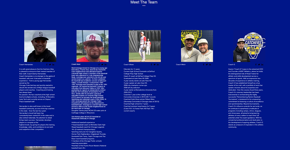
Catcher's Alley "Meet the Team" Before
UX/UI & Visual Direction
A major part of the redesign was creating more visual consistency across the site. The original experience had changing design treatments, inconsistent font use, and layouts that did not always feel connected from page to page. The proposal called out the need to clean up colors, typography, visual hierarchy, and overall cohesion.
I used the existing brand colors and identity as a foundation, then rebuilt the design system around stronger structure, clearer hierarchy, and a more polished athletic feel. The redesign kept the energy of a baseball and softball academy while making the site feel more modern, readable, and professional.
Content Organization
The site had a lot of useful information, but it needed to be easier to digest. Some pages had too much copy up front, while other important areas needed more context. I helped reorganize and rewrite content so pages felt more purposeful, scannable, and easier for users to move through.
This included simplifying dense information, creating clearer page sections, improving calls-to-action, and making sure the most important details were easier to find. For pages connected to programs, camps, teams, booking, and the store, the goal was to reduce confusion and help visitors understand what they needed to do next.

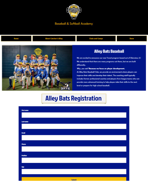
"Alley Bats" before and after.
"Alley Bats" Page Before
"Alley Bats" Page After
Responsive Design & Functionality
One of the biggest issues with the original site was that it was not displaying or resizing properly across screen sizes. The redesign focused heavily on improving the responsive experience so the site would feel more usable on smaller computers, tablets, and phones.
I rebuilt the layouts with mobile and desktop behavior in mind, adjusting spacing, navigation, visual hierarchy, and page flow so the experience felt cleaner across devices. I also helped troubleshoot areas where items were not responding correctly, overlapping, or creating display issues.
Key Pages Reworked
The redesign touched the full site experience, including the homepage, Alley Bats Baseball Club, store, product pages, Dominican Camps, booking, store, and team-related sections.
Each page was approached with the same goal: make the information clearer, the visuals more consistent, and the next step easier to understand. Some pages needed a full visual overhaul, while others needed better organization, stronger hierarchy, or cleaner responsive behavior.
The Outcome
The final redesign created a cleaner, more organized, and more professional website for Catcher’s Alley. The updated site gave the business a stronger online home, simplified the visitor experience, and made it easier for users to understand the academy, explore programs, view updates, and take action.
The project transformed the website from a cluttered and difficult-to-navigate experience into a more cohesive digital presence built around clarity, usability, and stronger visual structure. It gave Catcher’s Alley a site that better reflected the energy of the business while making the experience easier for families, athletes, and teams to use.


Individual product page before
Individual product page after


Final pricing plan purchase page
The Website Build
I designed and built the full website from start to finish, including every page, layout, integration, and user flow.
The finished site brought together the brand identity, UX/UI planning, copywriting, and technical build into one cohesive online home. I also walked through each integration and setup step to make sure the site functioned smoothly and could support the business beyond launch.
The Outcome
The final result is a digital home that gives Professor Alaimo a clear digital presence for his coaching work. The brand feels credible without being cold, structured without feeling stiff, and welcoming without losing authority.
By combining brand strategy, copywriting, UX/UI design, and website development, the project created more than a website. It created a foundation for Professor Alaimo to present his services clearly, build trust with potential clients, and guide insurance agents toward the support they need.