
INTRODUCTION
Health is not one-size-fits-all.
"I wish I had a lot more guidance. I don't realistically know if my ideas
of what is healthiest is what is best for me."
-Nick, 26
A staggering 79% of Americans are dissatisfied with their body image, and nearly half, 49%, express discontentment with their overall healthcare. Consequently, the conventional advice of "consult your doctor" fails to resonate with a significant portion of the population. People yearn for alternative avenues to discover health and lifestyle changes that suit their unique circumstances, without feeling uncomfortable or judged. Additionally, 21% of people have also suffered from a mental health condition. Mental health directly and indirectly effect people's physical health, making good mental health an important, and often overlooked, factor in a healthy lifestyle journey. Users need a way to collect all their health and wellness data in one place because this will allow them to find solutions to live a healthier life that are specific to them and their individual needs.

DISCOVERY
Understanding the landscape to design a more holistic health experience.
In order to fully understand the market and the problems with existing products that Health U could aim to solve. The goal was to create an experience for users that allows them to track their food intake and fitness while also allowing them to track their overall well-being and give them tools to better understand what they can do to achieve their goals and maintain a healthy lifestyle. Based on the goals, I chose to take a look at MyFitnessPal and Fooducate.
Both platforms offer users unique experiences that could help them reach their health and wellness goals in order to lead a healthier lifestyle, but the areas they lack put a huge dampener on the overall user experience and the success of the user to make healthy lifestyle changes that fit their own personal needs. MyFitnessPal comes closer to being a full-service platform for users, but it still lacks some features and customizations that would make the user experience superb and allow users to reach their end goal.


User Personas
Listening to users to uncover real needs
Once the competitive landscape was established, the focus shifted to understanding the user. The goal of the survey was to gather baseline data on current habits related to healthy eating, exercise, and mental health. These foundational questions helped assess users’ comfort levels with their existing health and wellness routines and identify common patterns in behavior.
The survey results also informed the structure of the user interviews. By analyzing responses across age groups and habits, I was able to determine which users would provide the most meaningful insights and what topics required deeper exploration. The survey ultimately served as a jumping-off point for crafting targeted interview questions that explored not just what users do, but why they do it.
The goal of the interviews was to further examine and contextualize survey findings. Using survey responses as a guide, interview questions were designed to uncover user expectations, frustrations, and unmet needs related to health and wellness tracking—particularly in mobile applications. These insights directly informed the design decisions and the creation of user personas.
CONCEPTION
Designing user flows around real goals, not features.
These task analyses and user flows translate research insights into actionable experiences. By mapping real user goals to clear, step-by-step flows, the focus was placed on reducing friction, supporting decision-making, and ensuring users can confidently complete key tasks within the app.

"As someone who is newer to a healthy lifestyle, I want to be able to get advice and guidance throughout
my journey so that I can make sure I am making the most effective choices."
-Dean
Objective Two:
Log in to the app, browse content, and start a chat session with a professional
User Flow:
1. Open app
2. Sign in
3. View dashboard and navigate to workout page
4. Select recommended workouts (based on input user health data)
5. Browse recommended workouts
6. Select a workout to view details
7. Begin a chat session with a professional (chat icon will appear in all screens)
8. Select reason for chat (questions regarding if an item will be good for user, questions about moves, questions about other options, etc.)
9. Verify health data is still up to date (weight, dietary restrictions, physical limitations, etc.)
10. Connect with a professional*
*Success criteria
"As a working professional, I want to be able to find healthy recipes and activities all in one place
so that I can spend less time planning things and more time focusing on mine and my family's health."
-Jennifer
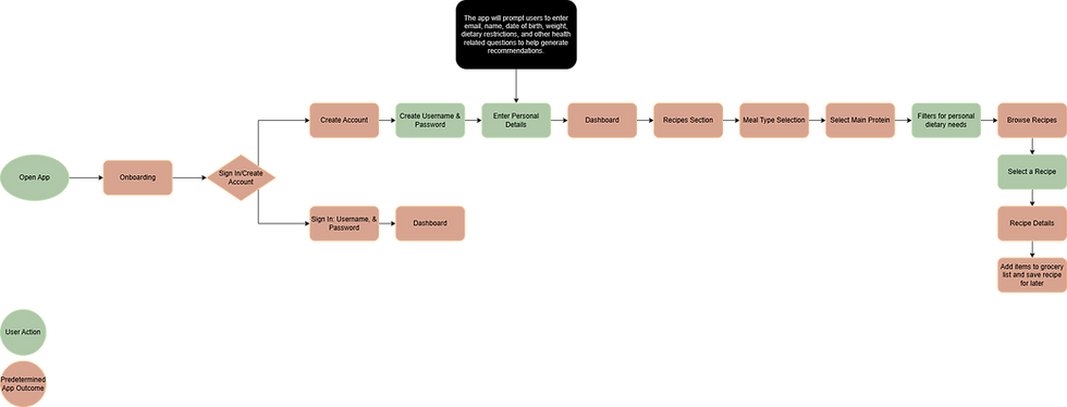
Objective One:
Create an account with Health U and find a recipe.
User Flow:
1. Open the app
2. Onboarding
3. Create an account/sign on screen
4. Navigate to the "Recipes" page
5. Meal type selection (breakfast, lunch, dinner, snack)
6. Select main protein
7. Filter by dietary needs (dairy free, gluten free, heart healthy, etc.)
8. Browse recipes
9. View recipe (view nutrition information, ingredients, time, ingredient alternatives, etc.)
10. Save recipe for later and add items to the grocery list*
*Success criteria
Translating user flows into tangible experiences
Wireframes were the first step in the physical design process for Health U, serving as the bridge between research insights and tangible interface design. Based on the task analyses and user flows defined earlier, wireframes were created to explore layout, information hierarchy, and interaction patterns while keeping the focus on usability rather than visual design.
Each key user flow was initially sketched to allow for rapid iteration and exploration. These sketches were then translated into digital wireframes using Figma, maintaining the intent of the original concepts while refining structure, spacing, and clarity. Throughout this process, wireframes were used to validate flow logic, reduce friction, and ensure that users could confidently move through critical tasks such as workout discovery, recipe selection, and access to professional guidance.

Low-Fidelity Workout Page

Low-Fidelity Chat Questionnaire

Low-Fidelity Chat

Low-Fidelity Workout Page
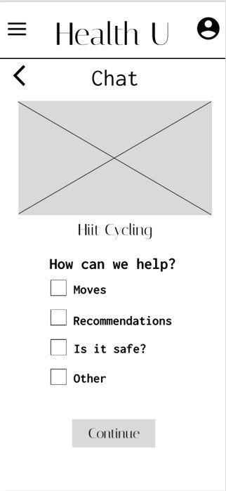
Low-Fidelity Chat Questionnaire

Low-Fidelity Chat
Evaluating clarity, usability, and value through user feedback
A usability study was conducted to understand whether Health U feels intuitive and valuable to potential users. By observing how easily users navigated the prototype and where questions or gaps emerged, this phase helped identify areas for improvement before refining the structure or features.
"The swap feature is the coolest feature I have seen in an app and it flows well."
"What each icon means in the onboarding is helpful and helps me learn for later."
"The chat is probably the most intuitive thing in this whole design. It is short, easy, and to the point."
Ensuring the experience is clear, intuitive, and valuable
The Test
Users were given 2 direct tasks and 3 scenario tasks to complete using the Health U prototype.
The Participants
There were six participants in this usability test. Each participant fit the target audience and had similar characteristics to those of the personas.
The Methodology
The test was conducted with a combination of remote moderated and in-person moderated. This schedule allowed those who had spare time the chance to sit down with me to conduct the usability test, but it also gave potential users who wanted to be a part of the tests but had time constraints due to work or familial obligations the opportunity to participate.
Findings & Insights
Observations:
Keeping the appearance clean and uncluttered is important to users
Users had an easy time locating all the pages on their own
Icons make it easier for all users to understand
The swap feature is great once they find it, but it needs to be labeled more clearly
Errors:
Icons did not display properly through the entire experience for some users
Label the swap feature better
Add resources to help users take body measurements for the check in portion
Add links to the nutritional analysis page so users who want to learn more about a particular topic can without having to go somewhere else to find more information
Add nutritional information to the recipe page and ingredient nutritional comparison in the swap feature
Turning usability insights into actionable design improvements
Design solutions were developed in response to usability testing findings. Each update directly addresses observed errors by improving clarity, accessibility, and reliability across the experience. These refinements focus on reducing confusion, supporting accurate user input, and ensuring consistent functionality across devices, ultimately strengthening the overall usability of the Health U prototype.

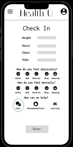
Icons not displaying properly
Retest independently across various devices. Use Figma troubleshooting techniques to ensure all icons display properly. Some icons will be switched out in favor of offerings from a different plugin that were tested and did not have issues appearing on different devices to ensure future testing can be more effective.
Label the "swap" feature better
Label each column as "ingredients", "swap", and "measurements" to make it easier for users to identify where to go.


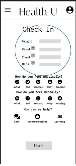
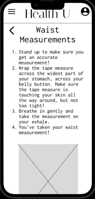
Add resources to help users measure at check in
Add a "?" next to each measurement to give users useful tips and an explanation of how to measure to ensure they collect and enter accurate data.
DESIGN EVOLUTION
An interface refined through real feedback, not assumptions
The screens of Health U evolved iteratively throughout the design process. While the core layouts remained largely faithful to the original sketches, usability and accessibility were continuously refined over time. Through ongoing user testing, peer feedback, and intentional iteration, the final app effectively addresses the original problem statement while delivering a clear, intuitive, and user-centered experience.


NEXT STEPS
Evolving with purpose
Health U will continue to be expanded on with more screens and features added. Continuous user testing will be conducted to ensure additions only add to the overall usability, not subtract from it. At least two more rounds of user testing will be conducted to ensure Health U flows well, is accessible, and continues to solve user problems. UI may be updated as time goes on based on user feedback.